How to make a typewriter animation using Vanilla JS and Highlight.js
Geni Jaho
8 min readYou’ve seen typewriter animations. You’ve seen the power of Highlight.js. Now you’re seeing the ultimate game-changer: typewriter animations for highlighted code, yay.
Typewriter Effect using Vanilla JS and Highlight.js
Most of the animations out there work only for a single line of text. Some even span multiple lines but only support a predefined text markup. Not ideal, let’s get started.
Highlight some code first
For demonstration purposes, we’re using code from the python requests library on GitHub.
<div id="code">
    def get_encoding_from_headers(headers):
        """Returns encodings from given HTTP Header Dict.
        :param headers: dictionary to extract encoding from.
        :rtype: str
        """
    content_type = headers.get('content-type')
    ...
</div>
Initialize the highlight.js library according to your project setup, following their usage guidelines. Then, highlight the code above:
<link rel="stylesheet"       href="//cdn.jsdelivr.net/gh/highlightjs/cdn-release@11.0.1/build/styles/base16/darcula.min.css">
<script src="//cdn.jsdelivr.net/gh/highlightjs/cdn-release@11.0.1/build/highlight.min.js"></script>
<script>
var target = document.getElementById('code');
hljs.highlightElement(target);
</script>
At this point, we’re here (minus the container styling):
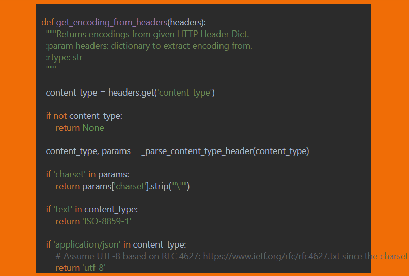
Code highlighted using the Darcula theme
Animate nodes, not individual characters
The struggle with animating code came from the fact that the various highlighters create their own markup. If we try to animate the text only, we get the desired typewriter effect, but we lose the highlighting. If we animate the whole HTML we may get highlighting, but this includes the markup itself, like, we’re printing <span class=> on the div.
So, we animate the nodes. It goes like this:
var children = Object.values(document.getElementById('code').childNodes);

target.innerText = '';

type(0);
Get all the child nodes of the highlighted code, empty the placeholder, and start displaying the nodes starting from the first one.
function type(i) {
    // Little helper
    function randomNumber(min, max) {
        return Math.floor(Math.random() * (max - min) + min);
    }
    // Make the content visible
    if (i === 0) {
        target.style.visibility = 'visible';
    }
    // When we've displayed all the nodes
    // Just start over
    if (i >= children.length) {
        i = 0;
        target.innerText = '';
    }
    // Append each node to the target code placeholder
    // And scroll that div if the code scrolls past it
    if (children.hasOwnProperty(i)) {
        target.appendChild(children[i]);
        target.scrollTop = target.scrollHeight;
    }
    // Step to the next node
    i++;
    // Repeat the process
    // after a variable amount of time
    setTimeout(function () {
        type(i);
    }, randomNumber(200, 500));
}
And that’s it for the JS.
Bonus styling improvement
So far we’ve been working with this minimal CSS styling:
#code {
  white-space: pre; /* So the code won't wrap */
  width: 600px;
  height: 300px;
  margin-left: auto;
  margin-right: auto;
  overflow-x: auto; /* You know, so it doesn't overflow*/
  overflow-y: auto;
  visibility: hidden; /* The yet unhighlighted code better hide */
}
Using various blinking cursors available online (couldn’t find the CodePen where I got it) we can add some extra styling.
#code:after{
    content: "|";
    animation: blink 500ms linear infinite alternate;
}

@-webkit-keyframes blink{
    0%{opacity: 0;}
    100%{opacity: 1;}
}

@-moz-keyframes blink{
    0%{opacity: 0;}
    100%{opacity: 1;}
}

@keyframes blink{
    0%{opacity: 0;}
    100%{opacity: 1;}
}
Also, those scrollbars become pretty ugly. We don’t need them in our case so:
#code::-webkit-scrollbar {
    display: none;
}
#code {
    -ms-overflow-style: none;  /* IE and Edge */
    scrollbar-width: none;  /* Firefox */
}
And that’s it, finally. Check it out on CodePen, and see it in action on my site.